Spring 2026 Spatial Representation & Analysis of Archives
Richard
Spring 2026: Showcase – Spatial Representation & Analysis of Archives
On May 15, 2026, graduate students in the INS608D class (“Spatial Representation & Analysis for Library & Archive Collections”) at the University of Maryland showcased original and innovative work.
This course was a practical exploration of geospatial techniques to manipulate and represent library and archival collections. Techniques include digitization of maps, geocoding, geolocating, georeferencing, vectorization, spatial analysis, 3D maps, LLMs and spatial data, computational analysis, and representation of library and archival content using open source and commercial tools, towards developing new access interfaces.
This course is part of a new series of 5-courses in Computational Archival Science (CAS) (see: https://ai-collaboratory.net/cas/). These courses are specifically designed for MLIS students interested in developing skills in digital curation and computational thinking but are also suited to INFO master’s students in other programs and doctoral students, as well as graduate students from other colleges. They currently include:
Coding for Non-Coders: LBSC708F: Introduction to Computational Archival Science (CAS) & Python
GenAI & LLMs: INST728L: GenAI & Large Language Models (LLMs) for Library and Archive Collections
Digital Curation/Data Science: INST742: Implementing Digital Curation
Graphs: INST608D: Using Network Visualization to Explore Library & Archive Collections
Students applied geospatial techniques throughout the semester using the Asheville, NC Urban Renewal Project’s archival records. This is part of an AIC project called Measuring the Impact of Urban Renewal. Map samples from these experiments include:
Mark Conrad, Co-Founder of the AI-Collaboratory and CAS Initiative, and former digital archivist for the National Archives, shared that: “Dr. Marciano has demonstrated how to effectively bridge the gap between theory and practice. In preparing students to become information professionals, there is no substitute for hands-on experience with some of the tools they are likely to encounter. The students clearly stepped up to the challenge. Their projects show a clear understanding of the tools and how to creatively use them. Congratulations to all!”
A three-week final project allowed students to showcase 9 original projects:
Kurosh JAFARI: StoryMap for Geolocating Historical Manuscripts from the Library of Congress
Bill STEA: A Map of Mythical, Paranormal, and Supernatural Folklore in Southern Maryland
Ana STARR: Mapping and Analyzing Asheville’s Owners in Polygons
Ben POLLOCK: An Exploration of Beach Haven’s Historic District
Noah JONES: The “Roaming” Emperor: Mapping the Travels of the Roman Emperor Hadrian
Samuel BESSEN: Mapping Baltimore’s Historic Sheet Music Publishers
Melanie BELKIN: Let’s Go Back to Rockville: A Community-Based QGIS Exploration of Montgomery County, Maryland
Shameem RAZACK: Embroidering Transit Density: Mapping Public Transportation and Material Data Visualization in Cook County
1. StoryMap for Geolocating Historical Manuscripts from the Library of Congress
Author: Kurosh JAFARI
Abstract: Developing a StoryMap for the Persian manuscripts housed at the Library of Congress. There are roughly 100 manuscripts in the Library’s Persian Language Rare Materials online digital collection. My StoryMap discusses the history of the collection at the Library, the geographic scope of the manuscripts’ origins, and highlights from different subject areas.
Dataset: I had to create my own dataset on a spreadsheet for this project, as none existed. I included the title, author, and scribe (if known), URL, notes on the manuscript, where it was written, latitude, and longitude geolocated/geocoded coordinates. All of the information will come from the Persian Language Rare Materials online digital collection.
Tools: ArcGIS, as this is what the Library of Congress uses to create StoryMaps (QGIS is only used by GIS librarians); the Library of Congress’s online digital collections for the metadata information for this project; included images in the StoryMap.
2. A Map of Mythical, Paranormal, and Supernatural Folklore in Southern Maryland
Author: Bill STEA
Abstract: The goal is to create a map based on a unique dataset: locations of mythical and supernatural folklore in St. Mary’s County, MD. I will use QGIS’s OpenStreet Map and then create vectors that outline specific areas in which there have been reports of hauntings, strange creatures, and other unusual occurrences. The dataset in the attributes table will involve specific pinpoints such as buildings and landmarks (ex. The Point Lookout Lighthouse, Moll Dyer Rock, etc.) as well as some areas that may have a wider area (ex. Sotterly Hill). Each area will also contain metadata summarizing the unique story of each point of reference. I will also create a raster layer of an older map of Point Lookout’s Civil War camp and place it over the QGIS OpenStreet layer. The map will create context for some of the local culture that has grown in these counties as these stories continue to be retold and passed down from generation to generation.
Sources & Datasets: (1) Monsters of Maryland : mysterious creatures in the Old Line State by Ed Okonowicz; (2) Haunted Southern Maryland (Haunted America), by David Thompson; (3) Ghosthunting Maryland, by Michael J. Varhola; (4) A map of Camp Lincoln in Point Lookout.
Tools & Approach: Using a QGIS OpenStreet map of the St. Mary’s County area, create a layer that will add pins to specific locations: creating polygons around certain structures and buildings where appropriate, and larger polygons that overlap for wider areas (forests, rivers, etc.). Once that is complete, I will attempt to move this over to Google Earth and create a video tour of some of the areas.
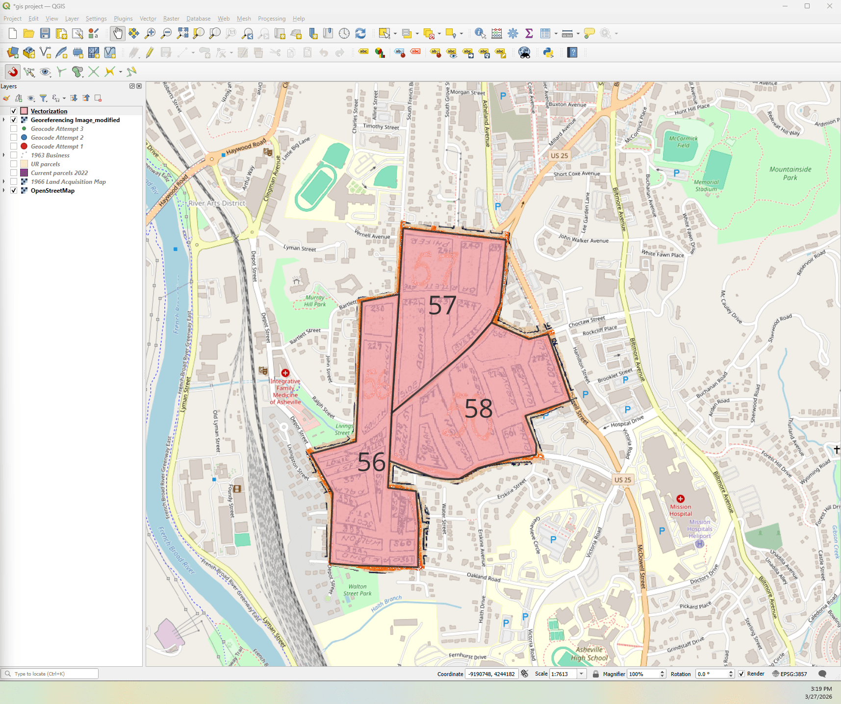
3. Mapping and Analyzing Asheville’s Owners in Polygons
Author: Ana STARR
Abstract: Working with the Urban Renewal Asheville data across the last few semesters. Building on some of the layers we explored in class, and using some of the Owners’ data to map and label owners. This builds on last semester’s graph database class and gives me another visual of where some of those names/parcels I grew familiar with are actually located, and how they have changed over time. Exploring additional Toolbox spatial analysis techniques. The project focuses on three 1950s Census tracts: 56, 57, and 58.
Datasets: Owners’ data, Urban Renewal Parcel layer, 1966 land acquisition layer, 1950 census map layer, and current parcels layer.
4. An Exploration of Beach Haven’s Historic District
Author: Ben POLLOCK
Abstract: Highlighting the historic district of Beach Haven, NJ, using the OpenStreet layer in QGIS, then applying a Sanborn fire insurance map of the district from 1911. Techniques used include: georeferencing, geolocating, and vectorization. Also using TerraLab, an AI platform to automatically segment images. This will allow the study of specific properties and their evolution from 1911 to 2026.
Datasets: QGIS, 1911 Beach Haven Sanborn Map (Princeton University Library), National Register of Historic Places Registration Form (Internet Archive), Other archival resources (Long Beach Island Historical Museum)
Tools: (1) QGIS Layers – Application of OpenStreet map, Sanborn map, (2) Georeferencing – Snapping and georeferencing a Sanborn map to Beach Haven Historic District, (3) Terralab – Segmentation of land parcels and individual properties.
5. The “Roaming” Emperor: Mapping the Travels of the Roman Emperor Hadrian
Author: Noah JONES
Abstract: I have always been obsessed with the classical world, so for my final assignment, I focus on the travels of the 2nd-Century Roman emperor Hadrian. Ruling at the peak of the Roman Empire’s power and prosperity, Hadrian is famous for visiting nearly every province of the empire during his over 20-year-long reign. I intend to plot out the cities he visited in Europe, Africa, and Asia throughout his reign as a means of both highlighting the wide breadth of Rome’s domain at its height and giving a sense of what cities were prominent during this period of Mediterranean history.
Dataset: Carole Raddato, a classics scholar and Hadrian fanatic who has actually made an effort to visit almost all of the places the emperor did herself, has created a detailed list of the cities he visited on her website, Following Hadrian. I will also make use of various layer files posted on Github that include a map of the Roman Empire, as well as its provinces and cities.
Tools: I installed the plugin Quick Map Service in QGIS to get a clean map with no modern-day borders or country names. On top of that, I added layers depicting a map of the empire during Hadrian’s reign, labels for the provinces, and labels for the cities to create an era-accurate grounding for the data. From there, I intend to plot the cities he visited.
Abstract: During the late 19th and early 20th century, glass manufacturing rapidly expanded in the United States, and became more concentrated in states like West Virginia and Indiana due to the energy resources in those regions and the expansion of railroads to make transportation of materials easier. I will track this growth and the simultaneous growth of supply lines.
Dataset: I am collecting data from the 1880 Census Report on Glass Manufacturing and the 1919 Directory of Glass Factories in the US. I am using Jeremy Atack’s timestamped railroad shp file.
Tools: I have collected county-level data about glass manufacturers for the years 1880 and 1919. I will create color-coded layers displaying this data in various ways, using color to show both the number of manufacturers and the number of glass furnaces, and growth over time for particular ranges. I also overlay a railroad map, timestamped to 1880 and 1919, to show how the growth of railroads impacted the expansion of glass manufacturing.
7. Mapping Baltimore’s Historic Sheet Music Publishers
Authors: Samuel BESSEN
Abstract: Applying GIS skills to historic sheet music publishers in Baltimore City. From the mid-18th century into the 19th century, Baltimore was a hub of popular American sheet music production, along with New York, Philadelphia, and Boston. In 2021, I began a project called Mapping Tin Pan Alley, using data about New York publishers to visualize the industry from 1880 to 1940. This visualization proved useful in tracking the migration of the industry northward through the city. This project would apply a similar lens to Baltimore, examining these publishers in the context of the city in which they thrived.
Datasets: Data about these publishers is spread over a variety of primary and secondary sources. I will use the following sources to determine publisher addresses and create a dataset. Primary Sources: (1) Historic sheet music, which often contains publisher addresses, (2) Historic Baltimore City directories. Secondary Sources: (1) Dichter, H., Wright, E. A., McDevitt, J. A., & Shapiro, E. (1941). Early American sheet music : its lure and its lore, 1768-1889. R.R. Bowker Co. (2) Sonneck, O. G., & Lowens, I. (1964). A bibliography of early secular American music, 18th century(W. T. Upton, Ed.; Revised and enlarged). Da Capo Press.
Tools: QGIS’s default Street map. Above that, I geo-reference the 1832 Fielding map of Baltimore City, which best matches the time period of the dataset. This shows changes to street names or locations in the city. I then geo-locate the above addresses using LatLong.net and Google Maps, adding a point layer above the historic map.
8. Let’s Go Back to Rockville: A Community-Based QGIS Exploration of Montgomery County, Maryland
Author: Melanie BELKIN
Abstract: My project is a largely exploratory experiment to map out the community resources of my hometown and potentially look at the historical development of the county as a whole. I have found several datasets of points-based information, including schools, veterinary hospitals, hospitals, libraries, and farmers’ markets in the area.I am also interested in mapping historical documents onto the modern terrain of Rockville. The larger goal would be to develop a timeline of the neighborhood of my childhood home.
Tools: QGIS, projecting PNG images onto the StreetMap layer
9. Embroidering Transit Density: Mapping Public Transportation and Material Data Visualization in Cook County
Author: Shameem RAZACK
Abstract: I will expand on the research and visualizations developed in my paper on public transportation commuters in Cicero Township and Evanston Township, Cook County, Illinois. With data from the 2023 U.S. Census Bureau’s American Community Survey (ACS) Table S0802, specifically the “Public transportation (excluding taxicab)” category, I will use QGIS to spatially visualize commuter density alongside the embroidered visualizations already produced for the project. While the original paper explored how stacked bar charts and embroidery could function as counter-visualizations that challenge the neutrality of statistical representation, this project introduces a geographic and spatial dimension through GIS mapping. By mapping transportation data onto CTA transit infrastructure in Cook County, I aim to examine how commuter density, race, class, and urban mobility are spatially organized and materially experienced across different suburban geographies. The project will continue to draw from Black studies, critical data studies, and Black geographies approaches to visualization, particularly the critiques of classification, enumeration, and “coded inequity” raised by Ruha Benjamin, Mimi Onuoha, and others.
Specifically, I will focus on: (1) Cicero Township public transportation commuters: 3,682 commuters, and (2) Evanston Township public transportation commuters: 5,608 commuters. Additional spatial data will include: (1) CTA rail line shapefiles (Pink Line and Purple Line), (2) Cook County municipal boundary shapefiles, (3) OpenStreetMap base layers, (4) Geospatial reference points corresponding to Cicero and Evanston transit corridors
Tools: QGIS with photographs of the embroidered fishbone stitch visualizations.